Every marketing dollar has to work harder than it should when a website isn't built to convert.
With each click required, the average abandonment rate is 33%. Just think about how many event sites have 5+ steps before checkout. That’s a lot of lost sales, y’all!
At Bauer Entertainment Marketing (BEM), we design event websites around one principle: turn traffic into ticket buyers as efficiently as possible.
What Makes a Great Event Website Design?
Great event website design closes the gap between a visitor's intent to complete an action, such as buying a ticket, and their ability to do so. For instance, a great site will load quickly on any device, surface relevant tour dates immediately, make the pre-sale signup path obvious, etc.
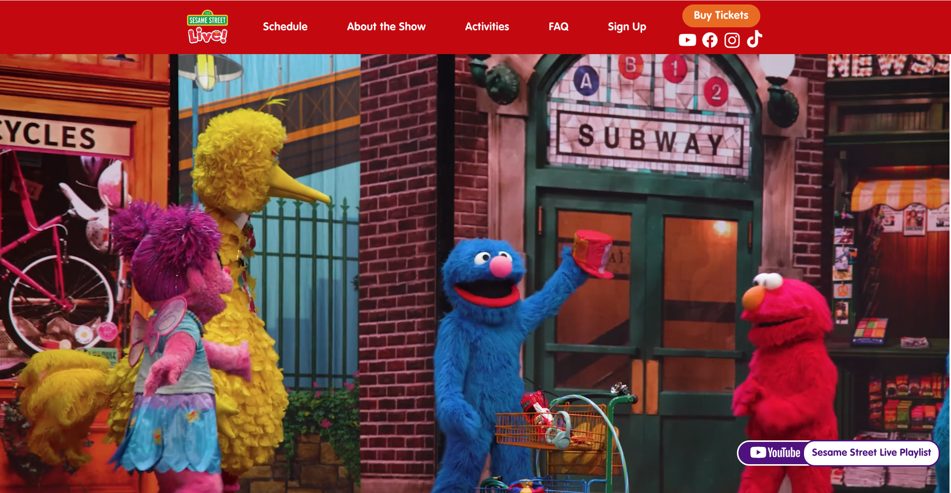
If you want an event website designed to maximize ticket sales, read on to learn how we designed conversion-focused websites for Round Room Live's touring shows, including Sesame Street Live, Blippi On Tour, and CoComelon On Tour.
1. Make the Buy Tickets Button Impossible to Miss
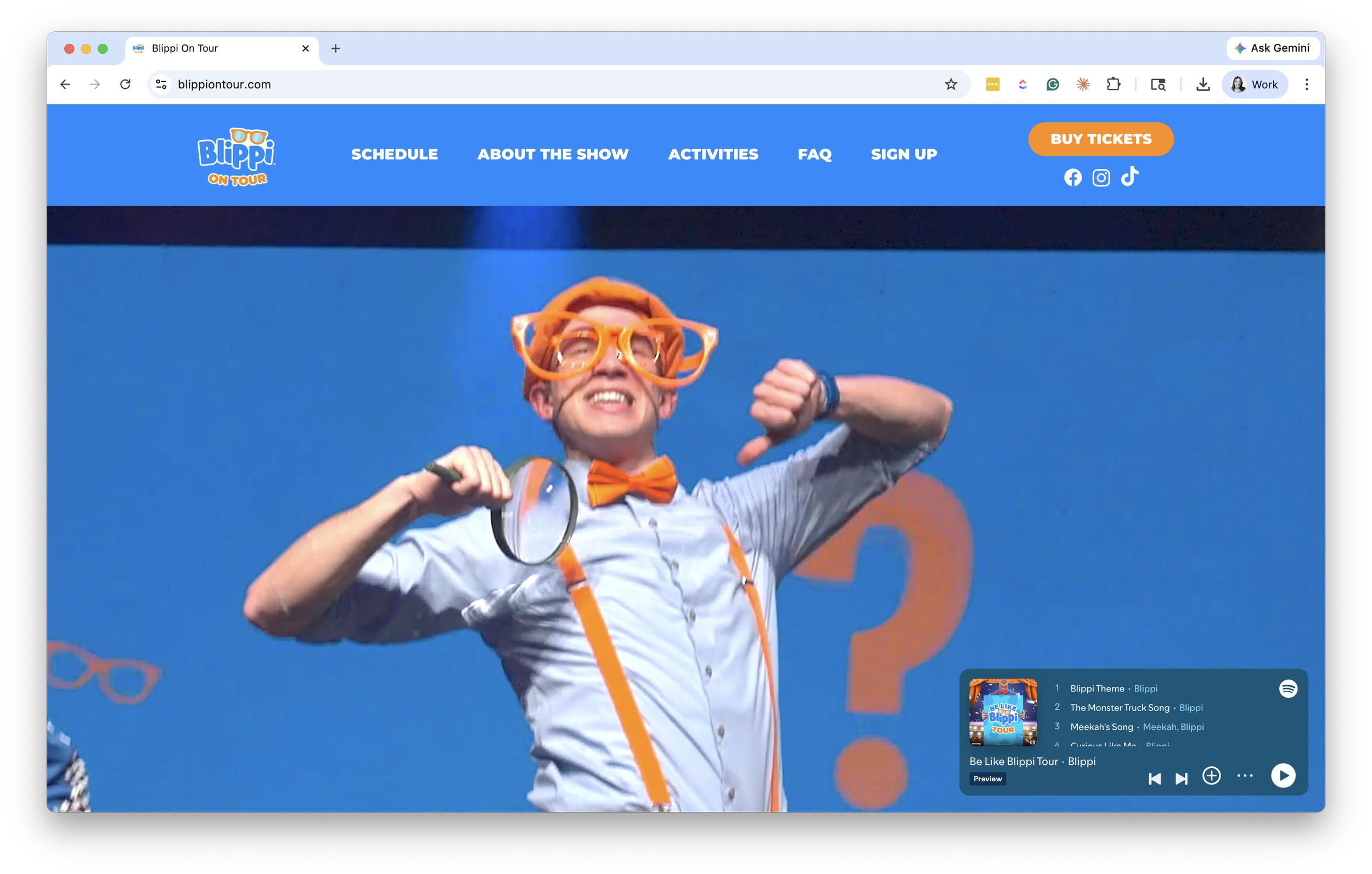
The most common mistake on tour websites? Treating "Buy Tickets" like any other button in the navigation. It gets the same weight as "About," "Cast," or "FAQ," and visitors have to hunt for it.
Tickets don't sell from a button that no one can find.
What works:
A primary "Buy Tickets" or "Find Tickets" button above the fold on every page
Sticky on scroll so it follows the visitor down the page
Repeated next to every tour date in the date list
Visually distinct from secondary actions (color, size, weight, all of it)
This matters even more when paid traffic is involved. A visitor coming from a Meta or Google ad has already told you what they want. They clicked because they're interested in your show. If they have to think about where to click next, you've already lost some of them.
2. Surface Nearby Tour Dates with Geotargeting
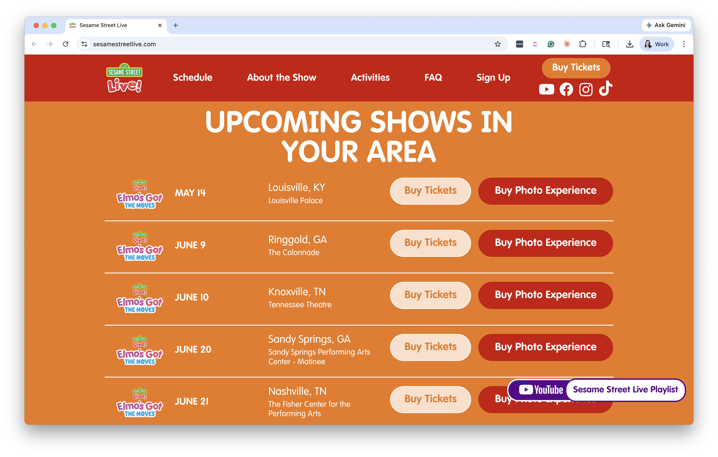
A national tour can have 40, 60, or 100+ dates. Dumping that full list onto a single page and asking visitors to scroll, search, or filter to find a relevant city is a conversion killer.
We built geotargeting into these sites for exactly this reason. The site detects the visitor's location and surfaces the closest tour dates first. The full schedule is still accessible, but the most likely-to-convert dates get the prime real estate.
The benefits compound:
Visitors see their city (or one within driving distance) immediately, no scrolling required
Out-of-market visitors still see the full tour and can sign up for alerts if their city isn't routed yet
Less friction means more conversions, which means a better return on every paid click
For tours where a single visitor might consider multiple cities (extended families, school field trips, fan travel), keep the full list easy to access. Geotargeting is a default, not a wall.
3. Design Your Event Website for Mobile First
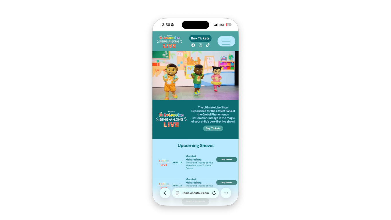
There's a difference between a site that works on mobile and one that's designed for mobile. Most event websites are the former. The tour date list is built for a desktop grid and crammed into a single column on phones. The hero image is sized for desktop users only. The FAQ accordion is fine on a laptop but fiddly on a thumb.
Mobile devices now account for 58.4% of all online event ticket transactions, and that share is growing every year. Whether it's parents browsing after the kids go to bed, season subscribers on a lunch break, or fans checking tour dates between meetings, ticket browsing happens on phones, in fragments of downtime. Visitors are moving fast. And they're not coming back if the experience feels broken.
What that looks like in practice:
The homepage layout is designed for vertical scroll and thumb reach, not desktop grid logic
The hero, date list, and primary CTA all hold up at the smallest viewport
Tap targets are sized for fingers, not cursors
Page weight stays light with smart image sizing, font choices, and minimal third-party scripts. Google has reported that 53% of mobile visitors abandon a page that takes longer than three seconds to load
The path from "land on homepage" to "click buy ticket" is no more than two taps
Mobile isn't a version of the site. For most of your visitors, it is the site.
4. Use Email Capture to Recover Lost Ticket Sales
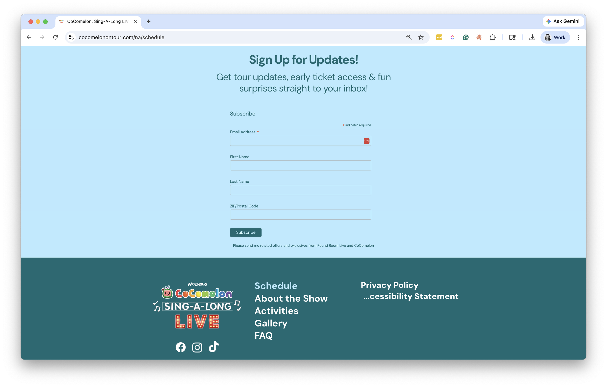
Most visitors to an event website don't buy on their first visit. Some are still deciding. Some are waiting for their partner to weigh in. Some are hitting dead ends: tickets aren't on sale yet, the show is sold out, or there's no date in their city.
Every one of those visitors is a frustrated potential buyer, and a missed sale. Worse, that disappointment lingers. It can negatively impact future sales and even your brand.
If your site doesn't capture those people, you're getting a fraction of what your traffic is actually worth.
A ticket-alert call-to-action turns website traffic into email addresses and phone numbers. Then, when tickets become available or new dates are announced, you can communicate directly and immediately with prospects eager to buy. Across BEM clients, ticket-alert emails and text messages convert at an average of 28%.
Different visitor types need different reasons to opt in:
Tour announcement alerts for fans whose city isn't routed yet ("We'll let you know when dates near you are added")
Presale and early access for engaged buyers who want first crack at tickets
Newsletter signup for ongoing fans of the brand or franchise
Cart abandonment recapture for visitors who started a purchase and didn't finish
Those captured emails feed your retargeting and CRM efforts long after the initial ad click. According to the Unbounce Conversion Benchmark Report, visitors who arrive at a landing page from email convert 60% more than visitors from paid social and 77% more than visitors from paid search. We've built recapture and retargeting flows for clients across the live event space, and the pattern always holds: the visitors who didn't convert today are some of your most valuable leads for the next tour cycle.
5. Build ADA Compliance Into Your Event Website from the Start
ADA compliance is not optional. It's especially not optional for family-facing brands. Nearly 4,000 ADA website accessibility lawsuits were filed in 2025 alone, with settlements typically ranging from $5,000 to $75,000. And beyond the legal exposure, an inaccessible event website excludes a significant portion of the audience who want to attend your show.
Retrofitting accessibility after launch is expensive, slow, and results in a worse outcome than building it in from the design stage. The right time to address it is during the design phase. Not after legal flags an issue.
The basics every event website should hit:
Color contrast that meets WCAG AA at a minimum
Alt text on every meaningful image
Keyboard navigation that works for every interactive element
Screen reader compatibility for date lists, ticketing CTAs, and forms
Captioned video where applicable
Form labels and error states that are readable by assistive tech
Not sure where your current site stands? Find out before a lawyer does. Our free ADA compliance audit flags every violation in plain language, with a clear path to fix it (yourself or with us).
Bringing It Together
Every lesson here serves the same purpose: to remove friction between a visitor and the ticket purchase process. The CTA should be obvious. The dates should be relevant. The device shouldn't matter. The handoff should feel seamless. The non-converters should still be captured. And the experience should work for everyone.
If your event website wasn't built with those principles in mind, the gap between what your marketing is delivering and selling tickets is bigger than it needs to be.
Curious about how your site is leaving tickets on the table? We'll send you 3 free ideas to fix it.